Introduction
Choosing colors for an entire home feels a lot harder than picking one room’s paint shade. Suddenly you’re thinking about flow between spaces, how colors work together, and whether that bold accent wall will actually age well. Good home color palette ideas aren’t about following one trendy scheme blindly — they’re about building a system that works across your whole home, room by room, without feeling disjointed. I made the mistake early on of picking colors room by room with zero coordination, and the result felt chaotic walking through the house. This guide covers how to actually build a cohesive palette in 2026.
1. Start With a Base Neutral
Every good home color palette needs an anchor — a neutral that appears in some form across most rooms, tying everything together.
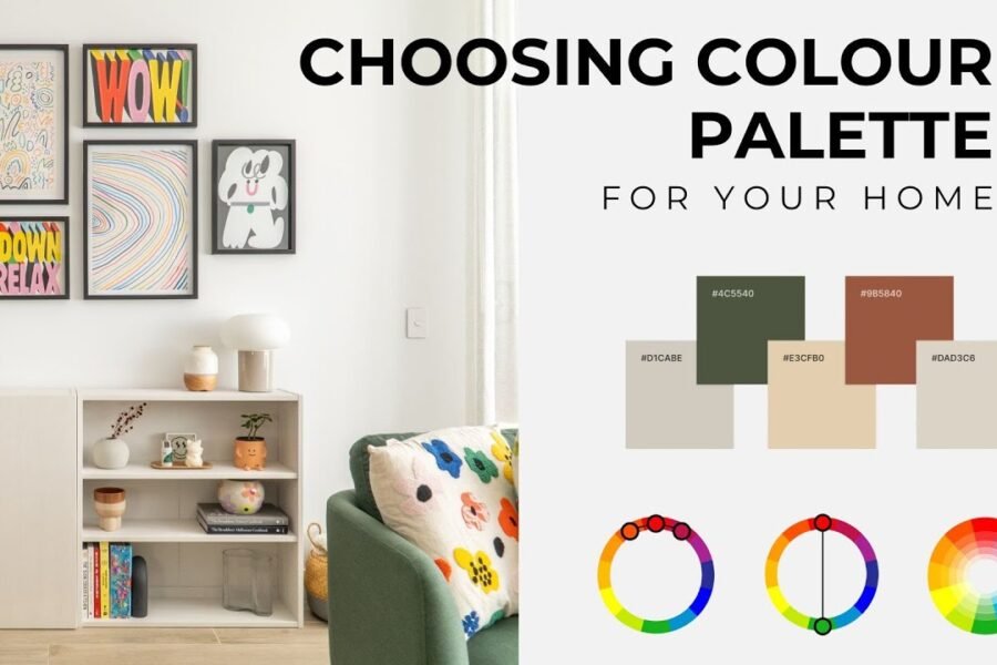
Quick answer: The foundation of effective home color palette ideas is choosing one versatile neutral — like warm white, soft grey, or light beige — that can be used consistently across connected spaces, creating visual flow even as accent colors change room to room.
2. Understand the 60-30-10 Rule
This classic design principle genuinely simplifies decision-making, and it works well for Indian homes too.
- 60% dominant color: usually walls, the largest visual surface
- 30% secondary color: furniture, larger decor pieces
- 10% accent color: cushions, art, smaller decorative details
I’ve noticed people skip this ratio and end up with too many competing colors fighting for attention. Following even a rough version of 60-30-10 makes rooms feel more intentional.
3. Consider Your Home’s Natural Light
Light exposure dramatically affects how colors actually read once painted, something swatches on a screen or in-store rarely capture accurately. [link to related paint color guide here]
Direct answer: North-facing rooms with cooler light generally suit warmer color palettes to balance the coolness, while south-facing rooms with abundant warm light can handle cooler tones like blues and greens without feeling cold.
4. Choose a Palette Based on Mood, Not Just Trends
Picture a small business owner in Jaipur who initially chose a trendy dark academia palette for her home office because it looked good online — within weeks, she found the space felt heavy and uninspiring for actual work. She switched to a lighter, sage-and-cream palette, and her mood in that room improved noticeably.
- Calming spaces (bedrooms): soft blues, sage greens, muted lavenders
- Energizing spaces (kitchens, workspaces): warm yellows, soft corals, bright whites
- Social spaces (living rooms): warm neutrals, earthy tones, occasional bold accents
5. Build Palettes Around a Single Inspiration Piece
A rug, a piece of art, or even a favorite fabric can anchor an entire room’s color scheme, making decisions far easier than starting from scratch.
- Pull 2-3 colors directly from your inspiration piece
- Use the dominant color for walls, secondary tones for accents
- This approach naturally prevents mismatched, random color choices
6. Test Colors Together, Not in Isolation
Has this ever happened to you — loving a color on its own, then realizing it clashes badly once placed next to your existing furniture or flooring? Testing combinations together avoids this entirely.
Related reading: 10 Interior Design Trends Dominating 2026
- Hold paint swatches next to existing furniture and flooring before deciding
- Test combinations in the actual room, under actual lighting conditions
- Consider how adjacent rooms’ colors will look together through open doorways
7. Don’t Ignore Flooring and Fixed Elements
Tiles, wood flooring, and countertops are expensive to change, so your color palette should work around them rather than against them. [link to related flooring comparison guide here]
- Warm-toned wood flooring pairs well with warm neutral palettes
- Cool-toned grey tiles work better with cooler color schemes
- Match undertones, not just general color categories, for a cohesive look
8. Allow Room for Evolution
A color palette doesn’t need to be permanent or perfectly planned from day one. Starting with a solid neutral base gives you flexibility to update accent colors as tastes change, without a full repaint.
Frequently Asked Questions
Q1: How many colors should a home color palette include? Generally 3-5 colors work best — one dominant neutral, one or two secondary tones, and one or two accent colors for details.
Q2: Should every room in my home use the same color palette? Not identical, but connected — sharing a base neutral across rooms while varying accent colors creates cohesion without monotony.
Q3: How do I know if a color will look different once painted on a full wall? Always test a large sample swatch (at least 2×2 feet) on the actual wall and observe it under different lighting throughout the day.
Q4: What’s a safe color palette for a home I plan to sell eventually? Warm neutrals with subtle, easily updatable accent colors tend to appeal to the widest range of potential buyers.
Q5: Can I mix warm and cool tones in one home color palette? It’s possible but requires care — generally, sticking to one dominant temperature (warm or cool) throughout creates a more cohesive result.
Q6: How often should a home color palette be updated? There’s no fixed timeline, but many homeowners refresh accent colors every 3-5 years while keeping the neutral base consistent longer.
Conclusion
Solid home color palette ideas come down to building a flexible system rather than picking colors room by room in isolation. Start with a neutral base, apply the 60-30-10 rule loosely, and test combinations directly in your space before committing to gallons of paint. Take it one room at a time if the whole-home approach feels overwhelming — consistency matters more than speed here.
Suggested Image Alt Text:
- “Warm neutral color palette swatches for home design”
- “Living room showing 60-30-10 color rule applied”
- “Sage green and cream color scheme in a home office”