Introduction
Standing in front of a paint shop wall with 40 shades of white can genuinely paralyze anyone. I’ve been there — picked a color that looked perfect on the swatch, then watched it turn oddly yellow once it covered an entire bedroom wall. Learning how to choose paint color properly isn’t about picking your favorite shade blindly. It’s about understanding light, room function, and how color actually behaves at scale. This guide walks through room-by-room considerations so your next paint job doesn’t end in regret, going into 2026.
1. Understand Natural Light Before Anything Else
This is the single biggest factor people ignore, and it changes everything about how a color actually looks.
Quick answer: When learning how to choose paint color, always test swatches on the actual wall under both natural daylight and artificial lighting — colors can look dramatically different depending on the room’s light exposure and time of day.
2. Living Room — Warm, Welcoming Tones
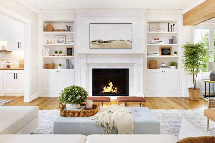
Living rooms benefit from colors that feel inviting without being overwhelming, since this is where most social interaction happens.
- Warm neutrals like beige or soft taupe work well for most spaces
- Sage green or muted blue add character without feeling too bold
- Avoid overly dark colors unless the room gets significant natural light
I’ve noticed people shy away from color entirely in living rooms, defaulting to plain white. It’s safe, sure, but a slightly warmer neutral often makes the space feel more finished.
3. Bedroom — Calming, Restful Shades
Direct answer: For bedrooms, soft, muted colors like dusty blue, sage green, or warm grey work best since they promote a calmer atmosphere conducive to rest, while bright or highly saturated colors can feel overstimulating in a space meant for relaxation.
- Avoid bright reds or oranges — they can feel too energizing for sleep spaces
- Soft pastels work particularly well in smaller bedrooms
- Consider darker accent walls for a cozier, more intimate feel
4. Kitchen — Bright and Practical
Kitchens deal with grease, splashes, and heavy daily use, so both color and finish matter here. [link to related kitchen renovation cost guide here]
- Light, bright colors make kitchens feel larger and cleaner
- Semi-gloss or satin finishes hold up better against grease and moisture
- Yellow, soft white, or light grey are popular practical choices
5. Bathroom — Fresh and Moisture-Resistant
Picture a small business owner in Jaipur who painted her bathroom a beautiful matte navy blue, only to watch it develop mold patches within months due to humidity. Bathroom paint needs to prioritize function over just color choice.
- Always use moisture-resistant or bathroom-specific paint formulations
- Light blues, soft greens, or crisp whites work well for a fresh feel
- Avoid matte finishes — they trap moisture more than satin or semi-gloss
6. Home Office — Focus-Friendly Colors
With more people working from home, this room deserves thought too. Colors that promote focus without feeling sterile work best here.
Related reading: DIY Exterior Painting Tips for a Professional Finish
- Soft blues and greens are associated with improved concentration
- Avoid overly bright or high-contrast colors that can cause visual fatigue
- Consider an accent wall behind your desk setup for visual interest
7. How to Actually Test Paint Before Committing
Has this ever happened to you — painting an entire room, only to hate the color once it’s fully dry and covering every wall? Testing properly avoids this completely.
- Buy small sample pots before committing to a full room
- Paint a section at least 2×2 feet, and view it at different times of day
- Let samples dry fully — wet paint color often looks different than dried
8. Coordinating Colors Across Connected Spaces
For open-plan homes, colors need to flow logically between rooms rather than clashing at doorways. [link to related decorating ideas guide here]
- Choose a base neutral that works across multiple connected rooms
- Use one or two accent colors consistently throughout, rather than a different bold shade per room
- Test transitions at doorways and hallways specifically, not just individual rooms
Frequently Asked Questions
Q1: How do I choose a paint color without seeing it in my actual room first? Always test physical samples on your walls — online or in-store swatches rarely represent how color appears under your specific lighting.
Q2: What’s the safest paint color choice for resale value? Neutral tones like soft white, warm beige, or light grey tend to appeal to the widest range of buyers if you’re planning to sell.
Q3: Should ceiling color match wall color? Not necessarily — a slightly lighter shade or classic white ceiling often works better, helping rooms feel taller and more open.
Q4: How many paint samples should I test before deciding? Testing 2-3 shortlisted colors is usually enough; testing too many at once can make the decision more confusing, not less.
Q5: Do small rooms need lighter paint colors? Generally yes, lighter colors help small rooms feel more spacious, though a well-lit small room can sometimes handle darker, moodier tones too.
Q6: How often should I repaint a room? Most interior paint lasts 5-7 years before needing a refresh, depending on wear, sunlight exposure, and room usage.
Conclusion
Learning how to choose paint color properly comes down to testing in real conditions, understanding room function, and resisting the urge to decide from a tiny swatch alone. Take the time to sample colors on your actual walls before committing to gallons of paint. Pick one room to start with this month, test a few shortlisted shades, and you’ll likely land on something you’re genuinely happy living with for years.
Suggested Image Alt Text:
- “Paint swatches being tested on a living room wall”
- “Soft blue bedroom paint creating a calm atmosphere”
- “Bright kitchen wall painted in light, practical color”